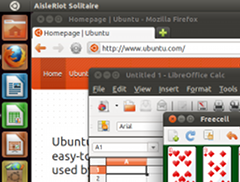
 It is probably fair to say that the Unity interface in Ubuntu 11.04 is quite controversial and has led to some mixed reactions. Last October Mark Shuttleworth, the leader of the Ubuntu project, announced that Unity would be the default interface on desktop as well as netbooks where it and its predecessor had become commonplace. I've been using Ubuntu 11.04 across three devices; a laptop, a touchscreen netbook and a computer connected to a television. I've decided to give up on Unity on the laptop and go back to the classic interface, but on the other two devices I quite like Unity. Here I am going to try to work out why Unity is a desktop no-go for me.
I was a bit disappointed with the Unity experience on a laptop to be honest. I've been giving a lot of thought as to why this just hasn't worked out for me. This feeling might seem illogical as I have been using Unity on my netbook for a while and quite like it, on the laptop it is exactly the same code behaving in the same way, so why does it not feel right? It turns out that when you press the Applications button in Unity there is a great big clue – the word “Apps” is used in titles. What do people associate the word apps with? Mobiles. What do laptops have little in common with? Mobiles.

Yes a laptop is mobile in the sense that it is easy to put in a bag and take from place to place but there the comparison stops. They usually have a full size screen, typically fourteen or fifteen inches, they have a full keyboard and a pad that allows for full mouse emulation. They also can have lots of memory and processing power. Mobiles on the other hand typically have limited screen space, limited support for keyboard and mouse interaction and may have restricted processing power. Interestingly these constraints don't just relate to mobile phones, netbooks, tablets and interactive TV systems share some of the same challenges.
Given these restrictions compromises about what is shown on the screen at any one time and about how an application might work are made in order to improve the user experience. In the case of TV this is because the user is sat ten feet away with only a remote control to operate the device. In the case of netbooks it is because they have smaller screens than laptops (typically ten inches). When Asus brought out the original EEE PC back in 2007 it had only a seven inch screen. One of its features was an Easy Mode desktop where applications had large icons on a tabbed menu. It made the device appear to be easier to operate and more friendly. Most importantly it was a menu designed for that size of screen. The Ubuntu Netbook Remix interface picked up on these lessons and set out to make the most of the screen space. These developments were very significant as they allowed users to get much more out of the machine thanks to a rethink of the traditional desktop.
I don't claim to be a usability expert and as a developer I have lost any ability to claim to be a "normal person" but the presence of the word "apps" should cause us to stop and think. An "app" on a mobile is often not quite the same concept as an "application" on a laptop. The "apps" model pioneered by Apple often relates to software that is quite focused on a single function, it might be a simple utility, a game, something to connect to a website. These apps are often not open source so might only have one developer working on them so the functionality possible might be limited, but the price to the user also cheap. Crucially they are also designed from the ground up for mobile devices, with touchscreens at the heart of the user interface. Applications on the other hand are often designed for mouse and keyboard. They might have many developers and rich functionality exposed through many menus and options. Traditional applications can seem at odds with Unity's touch screen friendly interface and levels of integration may vary. This makes Ubuntu 11.04 feel like a less integrated experience than its predecessors.
Could there be some confusion between the mobile and desktop worlds? I think this is certainly possible, the compromises needed to produce a good user experience do not necessarily translate well onto a desktop because the reasons for making those compromises don't exist and the inconvenience they cause become more noticeable.
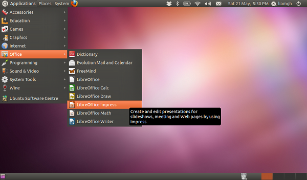
Take for example getting to the window menu for an application (File, Edit and so on). On Ubuntu Classic (below) this is located near the top of the window you are working on. In Unity you have to go right up to the top of the screen to get the top bar to change into the window menu (depending if the application supports it, this behaviour happens with Firefox but not LibreOffice). On a netbook this makes sense, the screen is small and every pixel is precious. On a desktop this makes no sense, moving the mouse up to the top of the screen to trigger a menu might only take a fraction of a second but because it is not needed it is enough for my mind to register the action and feel that something is wrong. Interestingly this seems to comply with Fitts' Law which says that the bigger an object is and the nearer it is will affect how easy it is to move to.

I heard a wonderful expression from a brand consultant on a TV programme the other day. He said that he would advise his clients to "check the bathwater for any babies" before going through with any major changes. This is a good thought to keep in mind when looking at the "classic" Ubuntu desktop, which is of course Gnome 2. It may have been around for a while but actually it has a lot of good points. One of my favourite features about the Gnome desktop is the way that applications are categorised in the menu. It makes everything organised and easy to find. This contrasts heavily with my Windows XP work PC that will pause for a moment then display a huge disorganised menu of programs that obscures most of the screen. Of course I could organise it manually, but that is what computers are for isn't it?
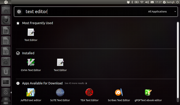
In Unity I found the process of getting to an application much slower. I have to click the Applications button then either click on the drop down list to pick the category to narrow the list down – or search for the application by name. It also shows application suggestions, I'm not sure if this is good or not. On one hand it is nice to be able to discover new applications, on the other it means that there is more on the screen possibly pushing the application I actually want off the screen. On the laptop I just found this all meant it took me longer to get to a program icon.
It is also really easy to switch between applications and documents thanks to the bar at the bottom of the screen, something which is awkward in Unity where I often found myself using Alt+Tab to switch between windows. The problem isn't helped by the shortcut bar on the left hand side autohiding. I'm not the only one who finds this tricky, Canonical's (the commercial company that backs Ubuntu) own usability study found that "multitasking on Unity is disconnected and difficult at times". Interestingly this study was conducted using a netbook and not a laptop. Also non of the participants was an Ubuntu user, maybe understandable if the aim is to get new people in, but retaining existing users is very important too, these are the people who will be actively advocating Ubuntu.
I think Unity visually looks great and it contains a lot of good ideas. In many ways it works well on netbooks and I think it looks great on a computer connected to a TV. It is not a bad initiative as such but I wonder if the decision to make it the default desktop has been a good one. I realise it is still developing and more customisation will be possible and I look forward to seeing that, but the idea of Unity as it stands being the default desktop in a long term service release is not a great prospect. To me it confuses elements of mobile and desktop thinking, some concepts just don't transfer. I have found that Unity on a desktop is awkward to use and slows me down, thankfully I can opt out and go back to classic mode, I hope this feature is not removed!
Desktops are not trendy anymore and their sales are falling so it makes sense for the Ubuntu project to look to other types of device for its future. It might be one day that when we use Ubuntu it is most likely to be on a tablet and we will use Unity or Gnome 3 quite happily, but at the moment it would be wise to stop and think who uses Ubuntu at the moment and where it is used. There is a possibility a lot of them might be geeky types with laptops, for them a sub-optimal desktop experience might be off putting. At the moment I would have to hesitate before recommending the current version of Ubuntu to anyone.
It would be great to hear how you feel about Unity and the points raised in this article. Comments are always welcome.
Fitt's Law
It's worth noting that, in Fitt's Law terms, objects stuck to the side of the screen are effectively infinite in size. So the top menu-bar is actually pretty easily acquired, despite the extra distance from the current window - you just hurl the mouse upwards without worrying about overshooting.
This is famously a point of distinction between Macs and Windows (Macs work like Unity, with a single menu bar across the top of the screen which changes depending on the current application). It was also a famous interface infelicity in the Windows taskbar until WinXP - the taskbar had a pixel or two along the edge of the screen which belonged to the task bar itself, rather than to the items showing in it - so if you just hurled your mouse to the edge of the screen to hit the window you wanted, you'd miss it.
Of course, I'm running Ubuntu/Unity it in a VM, with the mouse uncaptured - which makes for easy multi-platform use, but eliminates the benefit of having the menu bar at the top of the screen!
RE: Fitt's Law
Good points Doug. I have to confess I don't really get on with the Mac interface either! The point you raise about hurling the mouse is an interesting one, and it has made me realise I've never used Unity with a mouse, only a touchpad. Could this make a difference? If I remember rightly the KDE interface had an option to show window menus at the top, Mac style, You could just turn it on and off which was perfect for people coming from Mac or Windows. I suppose I don't want my computer forced into Mac like behaviours (or Windows). If I wanted my computer to behave like a Mac I would just buy a Mac!
Just a brief addendum to the
Just a brief addendum to the this discussion: Ages ago, some people did a study on the Mac / Mac users. Two monitors, stacked vertically, with the menu bar on the bottom monitor. They found that the average Mac user overshot the menu-bar by half-a-screen height, so the really were throwing their mouse up to get to the menu bar to take advantage of the infinite size the menu normally has.
NBR and bathwater/babies
It's interesting that you kept with Unity on the two devices. I tried Unity on my desktop, laptop and netbook. I found it horrible on the laptop and desktop for reasons I won't bore you with here.
On the netbook it wasn't bad, but the NBR interface (as at 10.04) is just much, much better. It hits the perfect balance between freeing real eastate and being very clear on a 10" screen. I'm glad it's a LTS release because I've yet to see a better netbook interface.
back to classic interface for me too
I tried Unity on my netbook, but couldn't get on with it, for much the same reasons you mention, so I too have gone back to the classic interface, although haven't yet figured out how to go back to the usual scroll bars (I find the the autohiding ones in Unity a complete pain to use).